
Despite the fact that my favorite flowers at the Point Defiance Rose Garden are seldom roses, the roses were definitely the main attraction on my last trip there, even if the yellow and white iris was my favorite shot of the day. Simply put, the iris were quickly disappearing, while the roses were nearly in full bloom, even if there were a few late bloomers still not showing flowers.
I continue to experiment with the HDR technique, and it produced some eye-popping colors even though I only chose among the presets labeled “realistic,” and more often than not chose the “natural” one, not the photographic one. My aim isn’t to produce the most striking photograph I can, but, rather, to produce a photo that recaptures as closely as possible what I saw when I took the picture. In fact, I suspect one of the main reasons I’m not fond of the rose garden is that there are so many garish colors in the varieties represented there. That said, the more you play around with the software the more you realize just how arbitrary the colors are in photographs. If you try to reproduce the pictures you see on the screen in a print, you’ll see just how arbitrary colors really are.
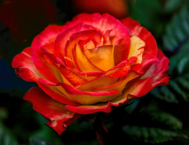
That said, here are my three favorite shots from the day, in no particular order. You’ve probably noticed that my favorite roses are usually orange and yellow, like this one.
I do realize, though, that a “rose” color is usually a pinkish-red, so I snapped a few shots of red roses, too.
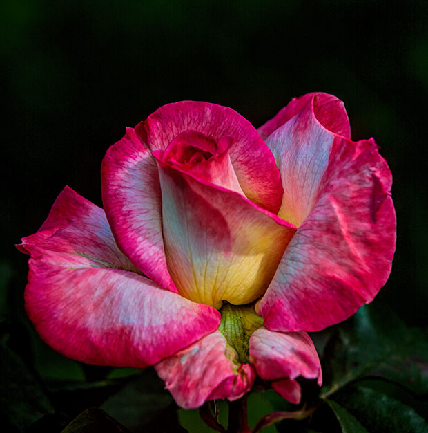
I wish these roses were actually growing in my yard so I could take my computer outside and see how closely this color matches the real color of the rose.
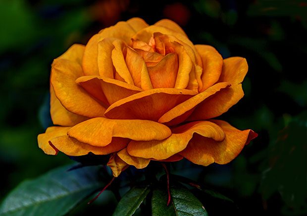
Somehow I remember it as being more yellow than this, but I shot so many roses that my memory could be totally off. If nothing else, I love its shape.
If you live in Tacoma, it’s time to get down to the Rose Garden because it’s peak season early this year.
Be still my heart. They are all gorgeous.
Awesome Loren – here’s one from my backyard http://www.flickr.com/photos/96656004@N02/9021418015/
Now that’s a RED rose, Doug.
Loren, I’m still catching up to your posts from my vacation, and this one is not only luscious in that way that roses have, but also brings up the whole mystery of color & perception & reproduction. I get a lot of printing done in my day job—brochures, annual reports & the like—and can barely hold on in discussions with my designers about what one sees thru the viewfinder, on various computer screens, the color chip, the proof, the final printing, and then the perception of the client, sitting in his office, maybe with overhead lights or not, a window behind him or not, who often enough says, “Nice, but is that really the color we agreed on?”
“Of course it is,” I say. “And isn’t…”
I’m always shocked when I try to recreate what I see on the screen with what comes off my high-end Epson printer.
I guess I should have known better since I was almost invariably disappointed with the color pictures in our yearbook when I was a high school advisor. I never could find what a picture should originally look like to get the final product I really wanted.